
We use visual storytelling to build and strengthen the image of Helsinki as a city where everyone can live a good and sustainable life – with the freedom to express themselves and live in the way that suits them best.
In images, Helsinki appears as a functional, sustainable, free, equal and trustworthy city: a city in which urban nature offers plenty of room to breathe and recharge, a city where you can sense its original and sometimes even quirky atmosphere throughout the seasons.
Photographs
Photographs tell a unique story of our city and convey strong emotions. We show the real Helsinki through interesting contrasts: it’s not just any urban city. The main characters in our images are Helsinki residents, staff, companies and visitors.

We use photographs to communicate freedom: our photos convey an idea of a Helsinki that is equal, where everyone can express themselves and live in the way that suits them best. We avoid stereotypes in our visual storytelling.
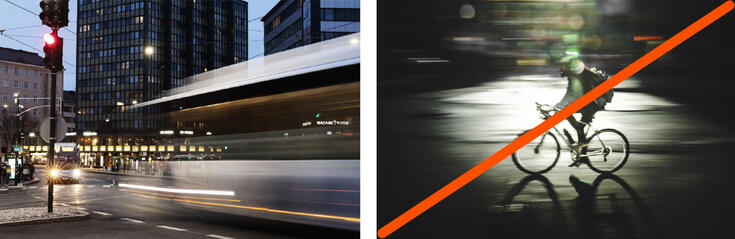
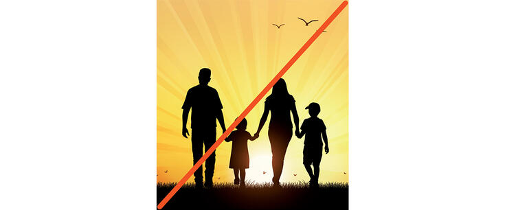
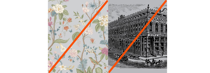
PLEASE NOTE: By using pairs of images, we encourage people to identify conventional thought patterns and to discover images that help us build a distinctive visual narrative in line with our brand. The images that have been crossed in the pairs could work in the right context.


Helsinki is wildly urban; it is a characteristic that combines both our physical and our spiritual connection with nature. Urban nature is present in our images, sometimes directly and sometimes more subtly.


By creating an eye-catching atmosphere in the images, we can highlight Helsinki’s extraordinary character. Changes in seasons and weather conditions provide opportunities to shoot original images that are visually captivating.


Sustainable and functional In the images, Helsinki appears as a city with a reliable infrastructure. We build sustainable solutions for the benefit of the entire world, while we live our lives in a functional environment.


We use images to convey an idea of a diverse city that is relaxed, free and humane. Not just happy people pose in our photos: we show life in all its variety. The effects used in our images, such as a sense of motion, are natural and understandable.

Our style is boldly authentic. Our wildly urban city comes across as a unique, sometimes wacky but genuine place.


In photos, the city’s extraordinary nature can be accentuated with lights, camera angles and cropping. Shooting in the evening, during a storm or from a new angle can create a visually captivating image, which allows us to evoke stronger emotions in the viewer, making the image and its message much more memorable.


Our images are timeless, fresh and natural. When photoshopping images, it is important to ensure that the result looks natural. We only use black and white images in connection with historical subjects.
Each image builds an image of our city. News images and images posted on social media channels build the brand the same way as images used in campaigns and advertising.


We can communicate sensitive subjects such as mental health, substance abuse, loneliness and homelessness indirectly through images, using methods such as shooting from a distance or with a shallow depth of field or a slower shutter speed through reflections, so that the service provider is visible while the client remains unrecognisable. Sensitive subjects may be easier to depict using illustrations than photographs. It is advisable to consult a professional when brainstorming illustrations and storyboards.


We often create a better image by describing the result rather than the service itself: an example would be a happy health and social services customer. We can approach the topic of salary through visual means, but instead of using conventional shots depicting someone spending money or a recruitment situation, we use pictures to convey the feeling of how much we like our job. An easy and tangible subject works best in photographs, and clichéd symbolism should be avoided.


In campaigns, there are no limits to ideas or the implementation of images. However, campaigns must be recognisable as part of the Helsinki brand and visual identity.


We can use wave motifs to combine colour surfaces or other images with photos to add different types of contrast.

The contrast between the natural and urban environments.

Combining two images to create contrasts in size and colour.

Combining a historical image with modern graphics.

Combining images and colour.
Links to the materials and more information on downloading images can be found in the Download elements section .
Always fill in a written consent form when you want to use any images in marketing. If the person to be photographed is a minor or dependent the consent form must be signed by the guardian. If the person is between the ages of 12 and 17, this person must sign the consent form themself, in addition to their parent or guardian.
In the photography permit, ask for consent for filming, publication and potential transfer of the images.
Please note/remember that the use of a person’s image and name in ordinary news journalism and communications is permitted without the person’s permission, provided that the use is necessary for news reporting and the context in which the image is used is not offensive. Images must also not breach the privacy of the person being photographed.
Download consent forms here (PDF, Finnish, Swedish, English) (Link leads to external service)
Illustrations
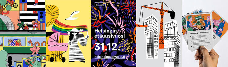
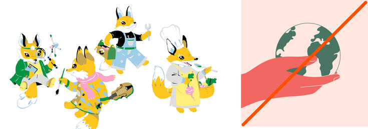
Illustrations are perfect for depicting abstract ideas, complex concepts and subjects that are difficult to photograph. Illustrations also allow us to demonstrate, enliven, decorate or clarify our messages. By choosing a specific illustration style and applying that style consistently across all materials, we can create recognisable visual communications.
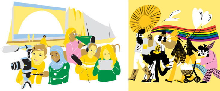
In the illustrations, we show a city where everyone can express themselves and live in a way that suits them best. An equal city welcomes all people and businesses, and everyone trusts each other.
Our illustrations depict Helsinki, not just any city. We always include recognisable Helsinki features and invest in insightful details.


We use illustrations to creatively share mad and funny stories. We can communicate Helsinki’s extraordinary character and visualise its wildly urban nature with illustrations.


We can visualise sustainable development, its goals and visions with illustrations. We try to avoid insipid symbols often used to describe sustainable development.
Clear and accessible visualisation of information and signage icons is an indication of a functional city. When we visualise information, we crystallise it and present it in a clear and interesting form. This means that the purpose of visualising information is to share information in an efficient and comprehensible manner, not to illustrate or decorate.
Abstract, pattern-like illustrations can be used in contexts such as in the production of distinctive campaign and event materials. Pattern-like illustrations are suitable for different applications. They are also a good option if suitable photos are not available or a photo would not be suitable for the intended use. When using a pattern-like illustration, a wave motif is usually not required.
We prefer illustration styles that are in line with the Helsinki brand: natural and relaxed, not too realistic or picturesque in their implementations.
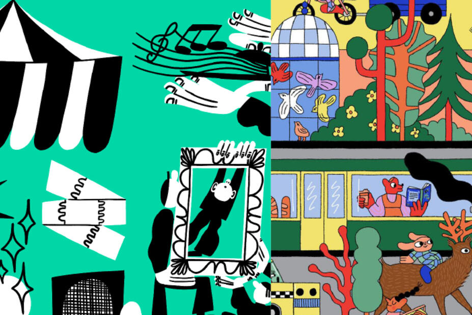

The wildly urban city can be depicted in a fun and flashy illustration style. Illustrations should be colourful and must use the city’s colour palette. We avoid using classical, historical and rustic-romantic illustration styles.

Imaginative illustrations can be used to describe Helsinki’s extraordinary character. By combining an image and illustration it is possible to create new meanings for the visual message. We prefer a clear and strong style and avoid illustrations that are too much in a fairy-tale or comic-book style.


Helsinki’s sustainability and functionality can be demonstrated using an approachable, accessible and clear illustration style. The style may be personal, but avoid overly abstract and conceptual illustrations.


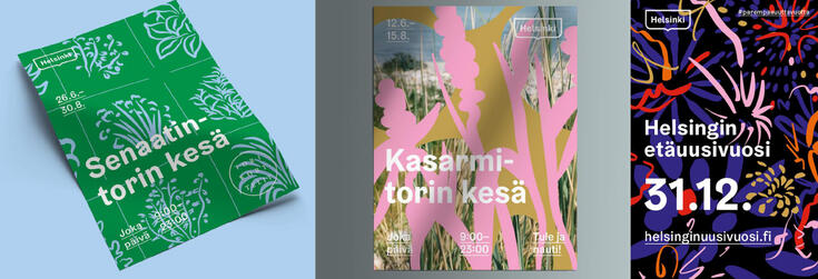
Illustrations are also well suited to campaigns. Campaigns are based on insightful ideas, and sometimes it may be easier to express an idea with an illustration than a photo. When illustrating campaigns, be sure to take Helsinki’s visual identity into account.

- Download illustrations here: City’s shared multi-purpose illustrations
- Use illustrations to liven up PowerPoint presentations, to illustrate news, websites and instructions, and to visualise information.
- Use illustrations in all kinds of communications: they are suitable for messages targeted at Helsinki residents and for marketing communications, from greeting cards to outdoor advertising.
- Combine illustrations in a creative way and use single elements.
Visualising information
These guidelines will help you produce visualisations that are clear, concise and visually consistent with the city’s brand guidelines. Read more about visualising information .

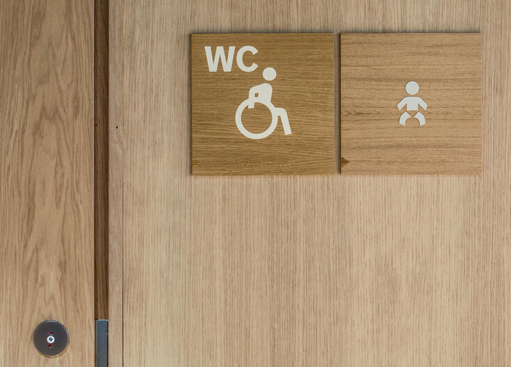
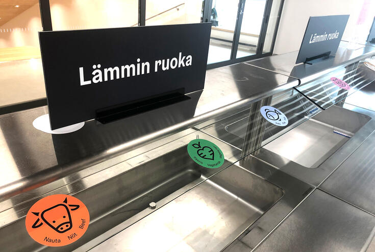
Icons
Hundreds of ready-to-use icons have been created for Helsinki’s visual identity. They convey messages in a simplified visual form. Icons work well in different sizes and often come without explanatory text. They are designed to match the visual identity. They all need to be designed in a consistent visual style.
Icons are designed for three purposes, each with different criteria. All types of icons can be used as illustration icons, but only icons designed for signage and user interfaces can be used for these purposes.


Signage icons need to be easy to understand and accessible. They are based on icons widely used across the world.
- Uses: indoor and outdoor signs in buildings and parks. You can also use them for illustration purposes.
- There are 311 ready-to-use signage icons available (updated in October 2022)
- Original file formats: PDF and SVG (vector), PNG (images) can be downloaded here
- New designs: specialised graphic design professionals
- The City Executive Office’s brand and events unit collects and compiles a library of signage icons for shared use.

Designing new signage icons
Examples of the principles of maintaining a uniform style:
- Make use of Helsinki’s visual identity in your design.
- Do not round the ends of the lines.
- Use the wave motifs associated with the visual identity.
- Make use of the existing elements and characters.
- Strive for the same, consistent style.
- Always use the same red circle for prohibitory signs.
- Use Helsinki Grotesk Medium font in icons.
- Filled pictograms are more helpful to visually impaired people.
- Combine outlined and filled forms.

- Use underscores (_) to separate words in file names.
- File names cannot contain letters Ä and Ö.
- The file name must also include the file name extension (e.g. png) before the dot so that the file format can be seen on all devices.
Here are some examples of file names:
- HKI_kulku_sallittu_png.png (Office programs and the internet)
- HKI_kulku_sallittu_pdf.pdf (printed materials and signs)
- HKI_ala_ruoki_lintuja_svg.svg (the internet)
Paper size: 120x120 mm
Formats: PDF, SCG, PNG. Resolution: 300 DPI

User interface icons are divided into eight categories:
- Arrows and operators
- Notifications and expressions
- Navigation
- Actions
- Forms
- Information
- Media and devices
- Social media
(Link to an external service)(Link leads to external service)
Explanations for the icons can be found on the same HDS page.
User interface icons should serve a clear and easy-to-understand purpose. Icons should not be used just for decorative purposes. It is recommended that you use a text label with an icon to provide a context. Icons themselves are ambiguous, and text labels clarify their meaning.
You can leave the text label out if the icon’s meaning is generally known or if it can be easily interpreted from the context. Volume buttons when playing a video would be an example of this. An icon and the associated content or text label must have the same meaning. Any contradiction or ambiguity in the meaning can confuse users and have a negative impact on usability and accessibility.
- Uses: digital services. Can also be used as illustration icons for illustration purposes.
- Responsible party, management and design: Helsinki Design System (HDS) design team.
User interface icons


Illustration icons are designed to work with explanatory text. They are used for illustration purposes.
- Uses: Visualising information, PowerPoint presentations, brochures, patterned illustrations, posters, products
- Cannot be used as user interface or signage icons
- There are 000 ready-to-use illustration icons available (updated in August 2022)
- Original file formats: PDF and SVG (vector), PNG (images) can be downloaded here
- Design: A graphic design professional or an illustrator
- Responsible party in the city organisation: The City Executive Office’s brand and events unit
Moving images
The following graphic elements of Helsinki’s visual identity are used in videos and animations:
- Helsinki framed logo
- Colour palette
- Typography
- Wave motifs (surface-dividing)
In order to ensure a uniform, distinctive and clear outcome, it is recommended that other graphic elements are not used in videos and animations.
Check the technical specifications for videos in the section Material instructions for different channels.
Please note that the instructions for moving images are for the UHD format and, for example, the accompanying templates are based on it. Templates are not available for every format, but these instructions are applied to suit other formats.

Only the Regular and Bold styles of the Helsinki Grotesk font are used in video and animation materials. Both styles can also be used in italics.
The examples of text styles below are for guidance only.

All the colours in the City of Helsinki’s colour palette can be used in video materials. Always ensure accessibility, i.e. that the text is easy enough to read. Take this into account when selecting pairs of colours and if you intend to position text over a background image.
Helsinki City colour definitions
Accessible colour combinations
Wave motifs can be used in videos and animations in accordance with the visual identity guidelines. Wave motifs should not, however, be overused or used in such a way that they interfere with the content.
Wave motifs can be used in the background of the Helsinki framed logo or in the background of the opening frame.

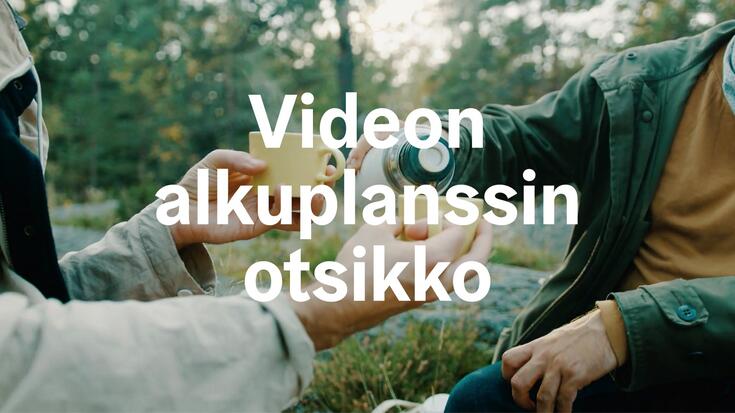
When positioning text on moving images, it is important to take into account the protected area, i.e. the title-safe area, which may become invisible on the TV screen or the cinema screen. Text should not be positioned outside this area.

Text can be positioned in the protected area in the opening frame either centred or aligned to the top left corner, on a colour background or on an image.
The text can be either white or coloured, depending on the background colour or the image.
Text font: Helsinki Grotesk Bold.

Centred text in an opening frame
The text in the adjacent template is 400 px and the line spacing is 100% of the point size, i.e. 400 px. The text is centred in the protected area both vertically and horizontally.

Opening frame with text aligned to the left
The text in the adjacent template is 400 px and the line spacing is 100% of the point size, i.e. 400 px. The text is aligned to the top left corner in the protected area.
Opening frame with centred text on an image
The text in the adjacent template is 400 px and the line spacing is 100% of the point size, i.e. 400 px. The text is centred in the protected area both vertically and horizontally.
Due to the dark background video, the text is white.

Opening frame with text aligned to the left on an image
The text in the adjacent template is 400 px and the line spacing is 100% of the point size, i.e. 400 px. The text is aligned to the top left corner in the protected area.
Due to the light background video, the text is in Metro orange.
Text can be positioned in the protected area in the full-screen overlays either centred or aligned to the top left corner, on a colour background or on an image.
The text can be either white or coloured, depending on the background colour or the image.
Headline font: Helsinki Grotesk Bold Text Font: Helsinki Grotesk Regular

Full-screen overlay with centred headline and text
The text in the adjacent template is 150 px and the line spacing is 120% of the point size, i.e. 180 px. The text is centred in the protected area both vertically and horizontally.

Full-screen overlay with centred text
The text in the adjacent template is 150 px and the line spacing is 120% of the point size, i.e. 180 px. The text is centred both vertically and horizontally.
Full-screen overlay with headline and text aligned to the left
The text in the adjacent opening frame template is 150 px and the line spacing is 120% of the point size, i.e. 180 px. The text is aligned to the top left corner in the protected area.
Full-screen overlay with text aligned to the left
The text in the adjacent opening frame template is 150 px and the line spacing is 120% of the point size, i.e. 180 px. The text is aligned to the upper left-hand corner.
Text is positioned in the protected area in the full-screen overlays either centred or aligned to the top left corner, on a colour background either on the left or the right. The text can be either white or coloured, depending on the background colour.
Wave motifs can be used on the edge of the background
You can also leave a title-safe area around the colour background, in which case the background needs to be positioned from the middle of the screen to the title-safe area. Wave motifs must not be used on the edge of the background.

Half-screen overlay aligned to the top left-hand corner
The text in the adjacent opening frame template is 100 px and the line spacing is 120% of the point size, i.e. 120 px. The text is aligned to the upper left-hand corner.

Half-screen text overlay on the right side with centred text Wave motifs can be used on the edge of the half-screen overlay.

Centred text in a half-screen overlay
The text in the adjacent template is 100 px and the line spacing is 120% of the point size, i.e. 120 px. The text is centred both vertically and horizontally.

Half-screen text overlay with a margin on the right side with centred text
Text is positioned in the protected area in the 1/3 screen overlays either centred or aligned to the top left corner, on a colour background on the left or the right. The text can be either white or coloured, depending on the background colour.

1/3 screen overlay aligned to the top left-hand corner
The text in the adjacent opening frame template is 80 px and the line spacing is 120% of the point size, i.e. 96 px. The text is aligned to the upper left-hand corner.

Centred text in a 1/3 screen overlay
The text in the adjacent template is 80 px and the line spacing is 120% of the point size, i.e. 96 px. The text is centred both vertically and horizontally.
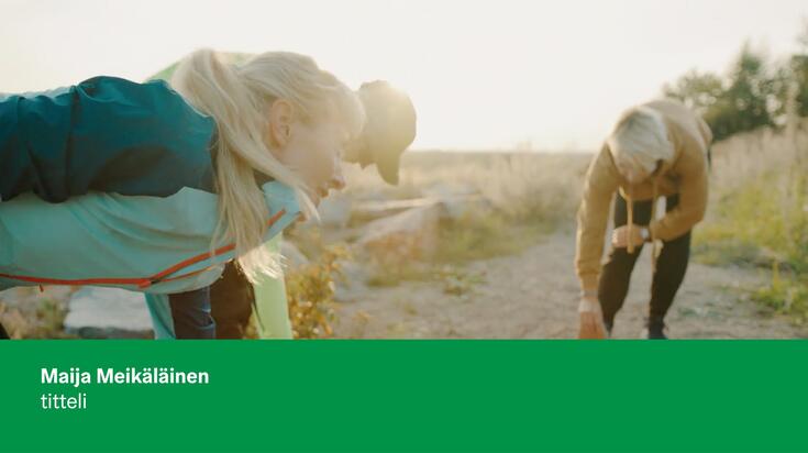
Overlays with names can be positioned either in the left or right upper or lower corner of the protected area. The text can be either white or coloured, depending on the darkness of the background video.
Overlays with names are normally positioned directly on the video without any background colour. A background colour can also be used in the background of the overlay if necessary.

Overlay with white text
The text in the adjacent opening frame template is 150 px and the line spacing is 120% of the point size, i.e. 180 px. The text is aligned to the lower left-hand corner.
The text can be aligned to the left or right in the lower third, on top of any subtitles.

Lower third when the video has subtitles
The name can be aligned to the left or right in the lower third, on top of any subtitles.

Overlay with a name with coloured text
The text in the adjacent opening frame template is 150 px and the line spacing is 120% of the point size, i.e. 180 px. The text is aligned to the upper right-hand corner.
Overlay with a name on a coloured background
The text in the adjacent opening frame template is 100 px and the line spacing is 120% of the point size, i.e. 120 px. The text is aligned to the lower left-hand corner. The text is positioned on a coloured background.

The name and the title can be positioned either on a background that stretches across the screen or the background can be limited to just the name and the title.

Closing credits are always placed on a colour background for legibility purposes. The text is centred horizontally. The title and the names are separated by Helsinki Grotesk Regular and Bold fonts.
The text in the adjacent template is 100 px and the line spacing is 120% of the point size, i.e. 120 px. The text is centred both vertically and horizontally.

The logo screen consists of the Helsinki framed logo and the background. The logo can be placed on an image or a coloured background. Wave motifs can also be used in the background.
The Helsinki framed logo is centred vertically and horizontally, and it is 1/3 of the video’s height in size.


| Video | Helsinki Channel | Social media channels | Raw video footage |
| File format | .mp4 tai .mov (H.264) | .mp4 tai .mov (H.264) | .mp4 tai .mov (H.264) |
| Frame rate | 25 | 25 | 25 |
| Video bit rate | Min. 7 Mbps, max. 10 Mbps in long videos, CBR | As per the publication channel requirements | 48 Mbps |
| Audio bit rate | 320 kbps | 320 | Stereo AAC or MP3, 320 kbps |
| Resolution | 1920 x 1080 | As per the publication channel requirements | UHD 4K (3840×2160) |
| Aspect ratio | 16:9 | As per the publication channel requirements | 16:9 |
| Scan type | Progressive | Progressive | Progressive |
| Audio | Linear PCM, stereo, 48 kHz or 44 kHz | Linear PCM, stereo, 48 kHz or 44 kHz | Linear PCM, stereo, 48 kHz or 44 kHz |
| Audio level | EBU R128 Standard -23 LUFS | EBU R128 Standard -23 LUFS | EBU R128 Standard -23 LUFS |
Maps
Maps are used in the city’s communications every day. Maps are used to inform residents about news and important topics, in surveys and evaluations, and to guide residents on construction sites – there are countless uses for maps.
The City Survey Services in the City of Helsinki Urban Environment Division has the main responsibility for the production and distribution of Helsinki maps. City employees have access to information about different services and materials in the Maps and geospatial data section on the intranet.(Link leads to external service)
Most commonly used maps
(content from general to more detailed):
- General map (three scales, Helsinki/Helsinki Metropolitan Area)
- Guide map (detailed/fewer details, Helsinki only)
- Cadastral map
- Base map
Maps can be viewed at: the Helsinki Map Service(Link leads to external service) or on the intranet PaikkatietoVipunen(Link leads to external service)
Product names appear on the floating link ‘Kartalla nyt’ in the bottom right-hand corner. The Map Services pages also contain a lot of other geospatial data. For more information on the data (in Finnish), visit paikkatietohakemisto.(Link leads to external service)
The City Survey Services’ maps are stored on the Mappi server available citywide (url: \\mappi.hel.fi\Palvelu, only available in the city’s internal network) and the Open geographic data(Link leads to external service) page. They are kept updated or updated at certain times of the year.
Publishing rights
The most commonly used maps are open data. However, any published material must include a copyright notice in the form © Kaupunkimittauspalvelut, Helsinki 20XX. The licence for the materials is usually CC BY 4.0. More information can be found on the open data page.
Self-service and customised products
Maps are generally sold through self-service. However, if customised products are needed, please contact kymp.karttatilaukset@hel.fi(Link opens default mail program) . The cost of detachment will be charged in accordance with the current price list for orders from outside the City of Helsinki Urban Environment Division.
Maps as vector files
The maps that are available as vector files (pdf/ai, in CMYK) are the general map and guide map, in which the different elements are on separate layers. For more information about the options and to place an order, contact: kymp.karttatilaukset@hel.fi(Link opens default mail program) .
Placing an order
When placing an order, you should know the area and the final size to be used in the printed product. This information will also help you choose the right product. The appearance of the maps can be customised, and sites and boundaries can be added (e.g. district and neighbourhood boundaries, school admission areas or other geospatial data). The City Survey Services team can transfer geospatial data to Illustrator using MAPublisher.
- The easiest way to copy a map is by using a screenshot from the Map Services/Paikkatieto Vipunen (intra), if the content does not need to be edited.
- Layers for graphic designers are also available from the Map Services,(Link leads to external service)
(Link to an external service), (Link leads to external service) and have been designed in collaboration with the Communications Division.
- Use the Print command to produce raster files that are more accurate than the screen resolution.
Just like printed products, maps for presentations can be customised to order.
- As with presentations, the easiest way to create a static map is to take a screenshot.
- An interactive map can be embedded from the PaikkatietoVipunen/Map Services using the Export, Share function.
- If you need to use a map or geospatial data in an application, this will be done through the geospatial data interface. Information about open data interfaces (Link to an external service)(Link leads to external service)
- and interfaces for official use can be found on the Maps and geospatial data page. Using a geospatial data interface requires an agreement with the City Survey Services. More information: paikkatieto@hel.fi(Link opens default mail program)
Awareness of social norms and accessibility
Disability, ethnicity, gender, body type and sexual orientation are diversity features that are taken into account in visual storytelling. Images and illustrations show people of all sizes and appearances. Visual storytelling is diverse, inclusive and non-discriminatory. It does not maintain stereotypes of any groups of people. Inclusion is depicted in a natural and truthful manner. People in images and illustrations are active subjects, not objects. They represent only themselves, not their disability, ethnicity or age.
All communications must be widely understandable and accessible. Images support accessibility as they generate interest, and they help people to understand and remember the topic. It is important that visual storytelling does not conflict with the other content, as the interpretation of images also affects the interpretation of the rest of the content. Like literacy of written text, visual literacy varies from person to person. People who have difficulty reading text, in particular, can understand a topic better through images.
- Think of the purpose of an image (e.g. to convey information, to complement the text, to evoke emotions), and choose the image that is best suited for this purpose.
- Assess whether those with poorer visual literacy can understand the image.
- Make sure that the emotion evoked by the image supports the other content (emotional message).
- Consider whether an abstract idea could be presented with an illustration rather than a photograph. (Photographs are often perceived as documentary, even if they are not meant to be.)
- Choose images that do not have too many details to distract the viewer from the actual message.
- When deciding on the layout, think about the order in which images and texts are read and position them accordingly.
- Use symbols and symbolic images with caution, as they can be difficult to understand. If you use symbols, use the most commonly known symbols for their most typical use.
- Consider whether the image or symbol needs text to support it.
- Check that the image is clear in the size and colours in which it will be used.
- Always add alternative text unless the image or graphic element is purely decorative.
Instructions for ordering and uploading images (PDF)
Instructions for the workflow and advice on what to take into account when you order photographs or illustrations (in Finnish). Download PDF(Link leads to external service)
Instructions for uploading images and metadata to the Gredi databank (in Finnish). Download PDF(Link leads to external service)